INTRODUCTION
AliveCor’s goal is to shift from direct-to-consumer device sales, to enterprise subscription sales and to become the 24/7 virtual cardiology center of excellence. There is a massive opportunity to provide comprehensive digital cardiology services to self-insured employers and payers who are spending nearly $8 billion on corporate wellness and $14B on chronic disease management programs.
For this project, I designed a Care Portal that helped coaches and physicians provide an end-to-end digital cardiology services.
Role: Wireframing, Design, Prototype
Tools: Figma, FigJam
Time Frame: 4 months with ongoing iterations
Role: Wireframing, Design, Prototype
Tools: Figma, FigJam
Time Frame: 4 months with ongoing iterations
The Problem:
How do we compete with other full stack digital cardiometabolic disease companies vying for this business?
The Solution:
Create an easy to use platform that provides end-to-end digital cardiology services that includes insight to personal data tracking, coaching, and clinician visits to members.
RESEARCH
To better understand Health coaches and their work flow, we spoke to internal subject matter experts and interviewed 6 health coaches and physicians who were experienced in setting goals for clients with hypertension.
Findings:
High Case Burden/Low Scalability
• Providers struggle to manage a high number of members with complex needs in one place
• Synchronous interactions limited the amount of support that coaches/providers can provide their members/patients
• Synchronous interactions limited the amount of support that coaches/providers can provide their members/patients
Access to parsable, comprehensive member data
• Providers lack insight into real-time data trends and progress changes to allow them to make
informed decisions about what care tasks a member should engage
• Even if providers do have access to member data, it is not organized in a way that is easily and quickly interpretable by the provider
• Providers may want to have access to certain data only (e.g. only blood pressures)
• The most commonly requested features by coaches were blood pressure readings and classifications, new/unread messages, and number of assessments.
Based on our findings, product strategy, and tight timeline, we decided to focus on the coach portal and later updating it with clinicians needs. We decided to use our existing Teleconnect feature for clinicians.
OUR PLAN
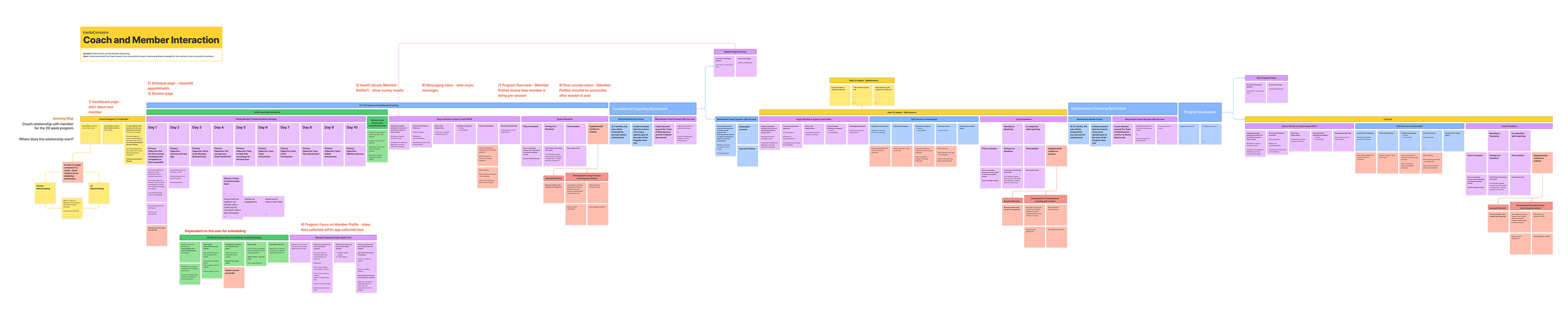
Journey Map and User Flows
To understand the coaches workflow and determine what pages would be needed for our Coach Portal, we mapped out the health coach's workflow to see where they would be taking actions to complete each of their tasks based on our research.
Sketches
With pages and information needed within each page defined, we still needed to define hierarchy. I sketched out the major pages to discuss with the project manager and other stakeholders.
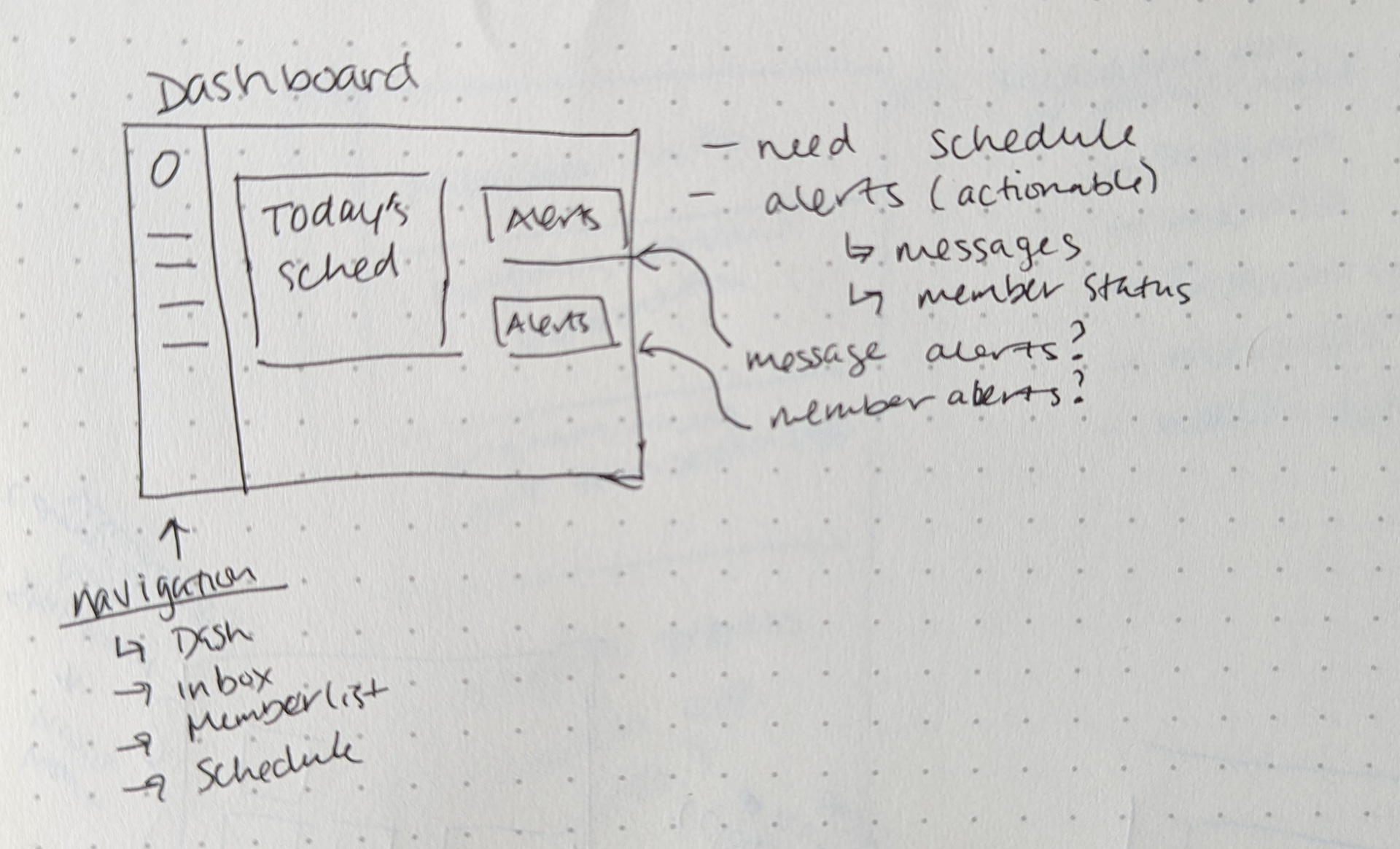
Dashboard - focus on daily schedule and actionable alerts
Member Profile - focus on flow of all info needed
Session Page - focus on flow and placement of notes
PORTAL SECTIONS
Dashboard
From our research, coaches need to view important and actionable data upon logging in to the platform. With that information, I created a dashboard notifying them of new messages and surveys, new member status changes, and their schedule for the day.
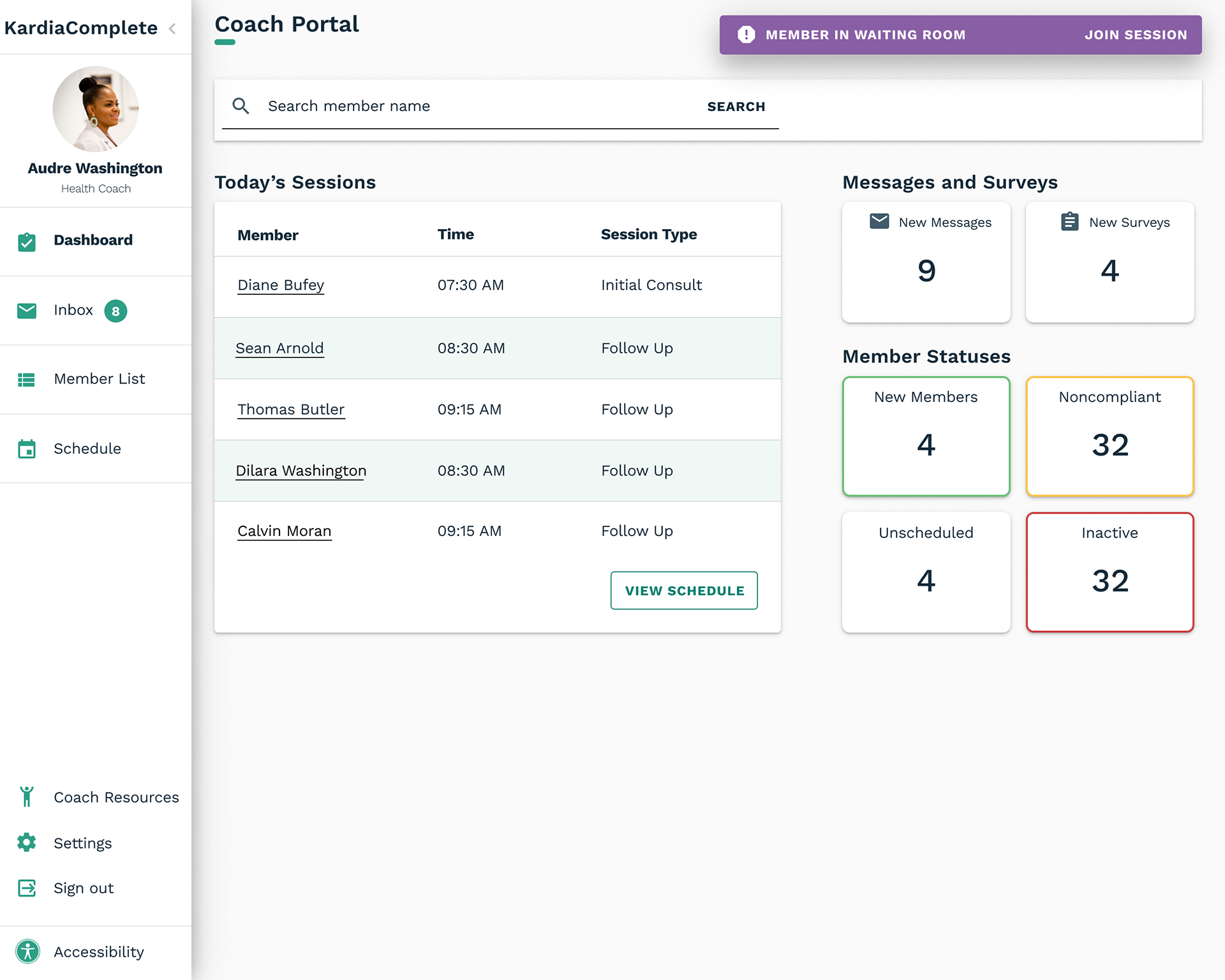
Dashboard focusing on new Messages and Surveys, Member Statuses, and daily Schedule.
Member List
Our interviews with health coaches revealed that coaches need to know which members are NOT actively engaging with the program. I created a filterable Member List page with an at-a-glance overview of their information and engagement status.

Member List showing BP, engagement, and status, information for each individual member. Potential 'Next Action' column prompting a coach to take an action if needed
Inbox
One of the coach's main workflows is being able to respond to member messages in a timely manner. I designed an inbox page to keep all incoming messages in one place allowing the coach to easily review and respond to messages.
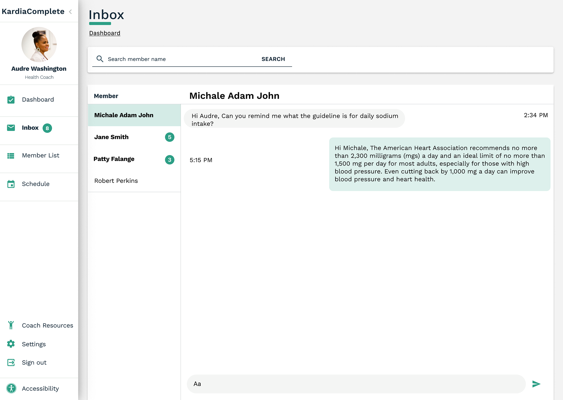
Inbox that shows all unread messages from members
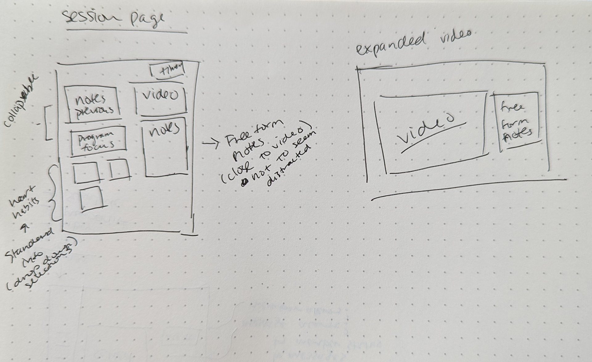
Session Page
From our research coaches emphasized that they wanted a combination notes form; form fields for standardized information and open text for notes. They also never want to appear distracted during a session.
Due to timeline and technical constraints, we decided to leverage an existing page from our Teleconnect product for this feature.
Due to timeline and technical constraints, we decided to leverage an existing page from our Teleconnect product for this feature.
I redesigned it by adding dropdowns for standardized information and free form notes. I also decided to include a previous notes section for coaches to have easy access to information they would need. That reduced the need for them to look away from the page and appearing distracted.
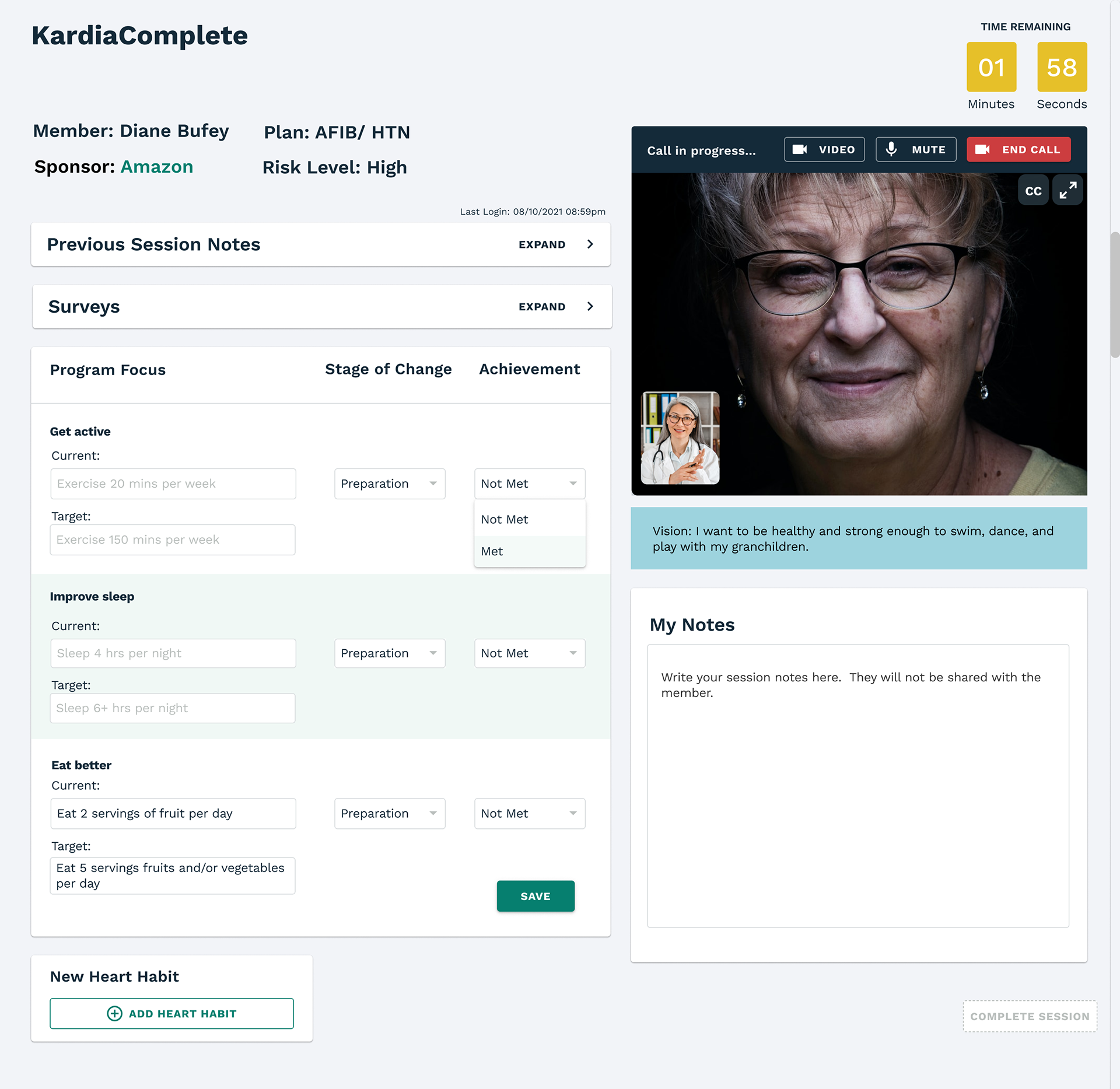
Session page with standard info dropdown fields and free form notes
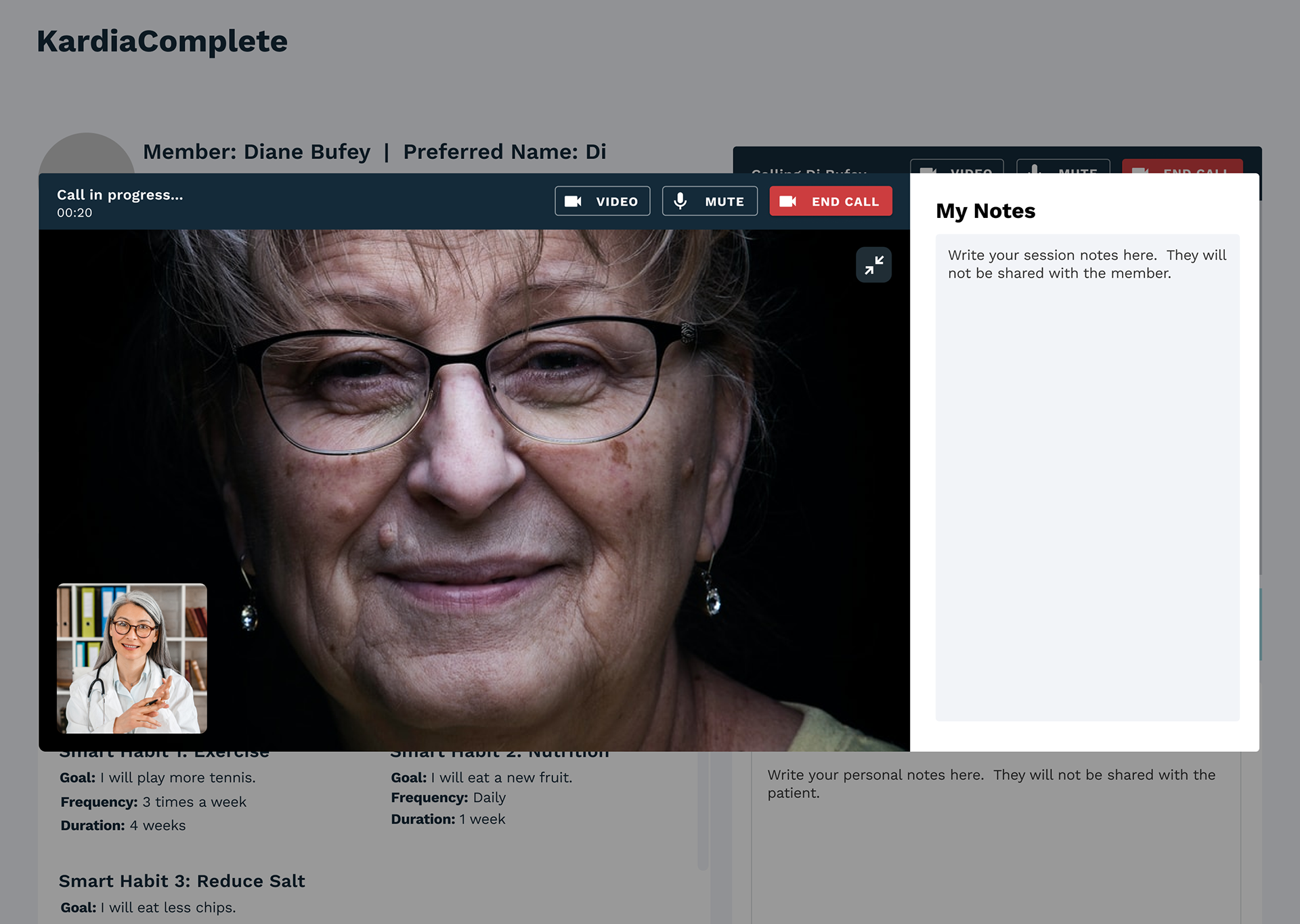
View with video expanded
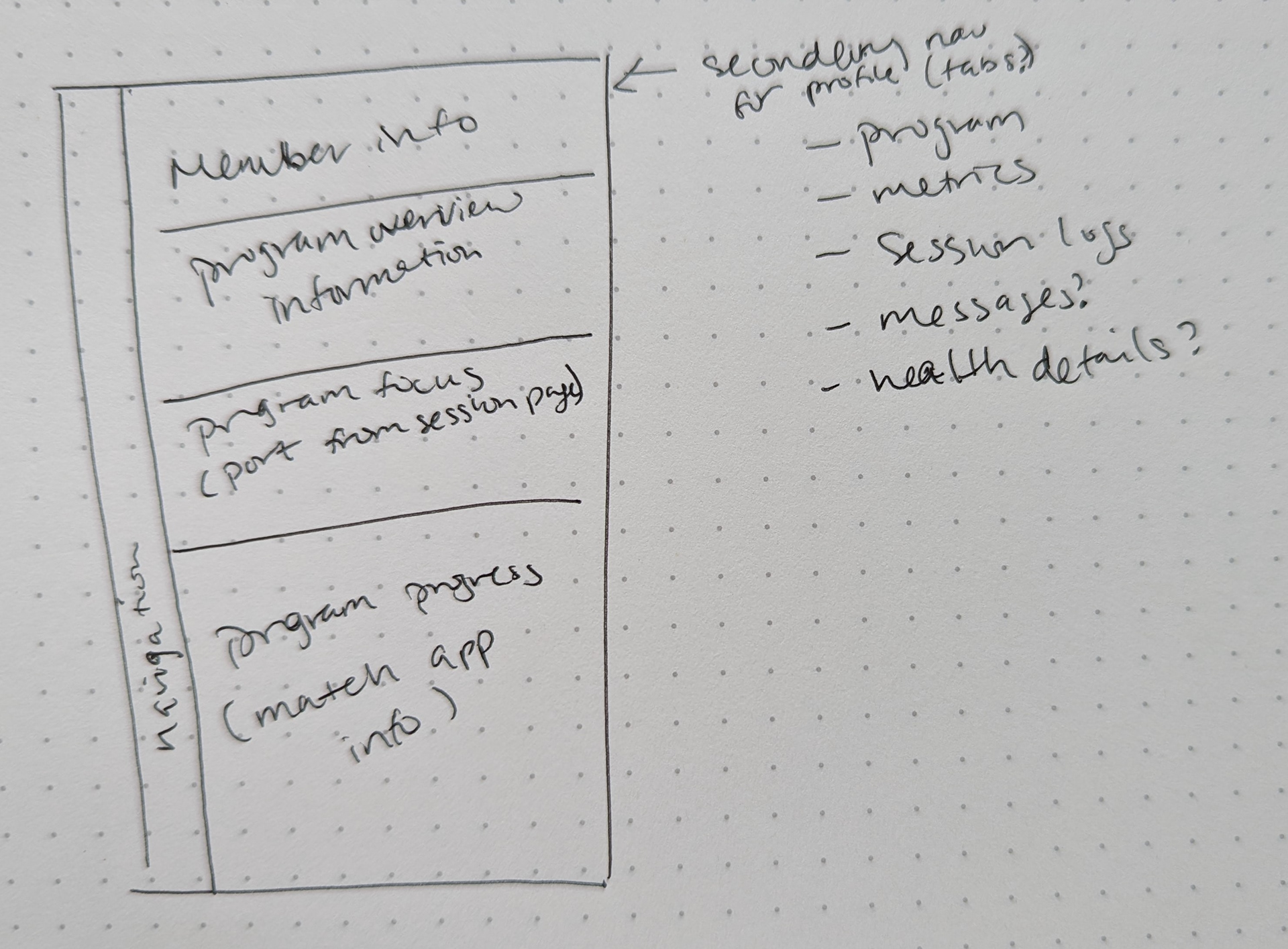
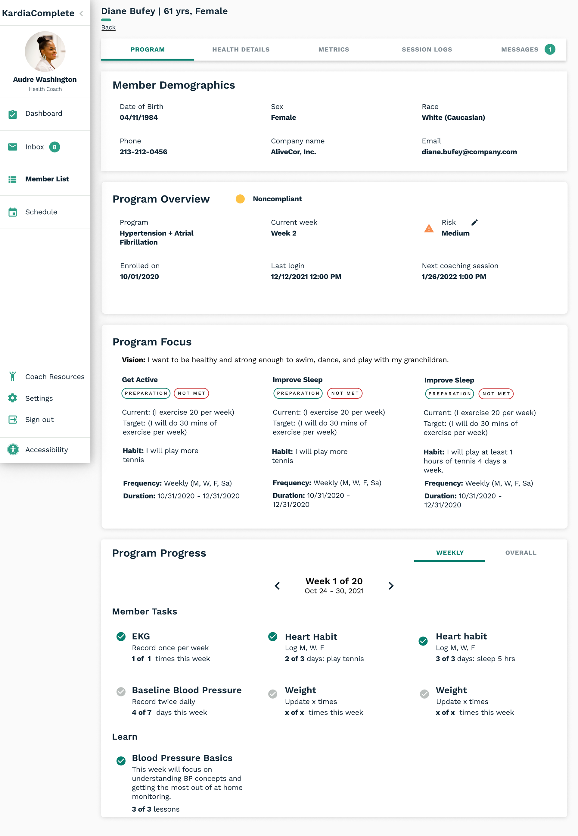
Member Profile
One of the major issues of coaches and physicians is finding parsable, comprehensive member data. I created a Member profile that surfaces program details and progress. To give more access to relevant contextual data, member's health details were included in the Member Profile.
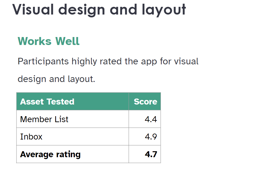
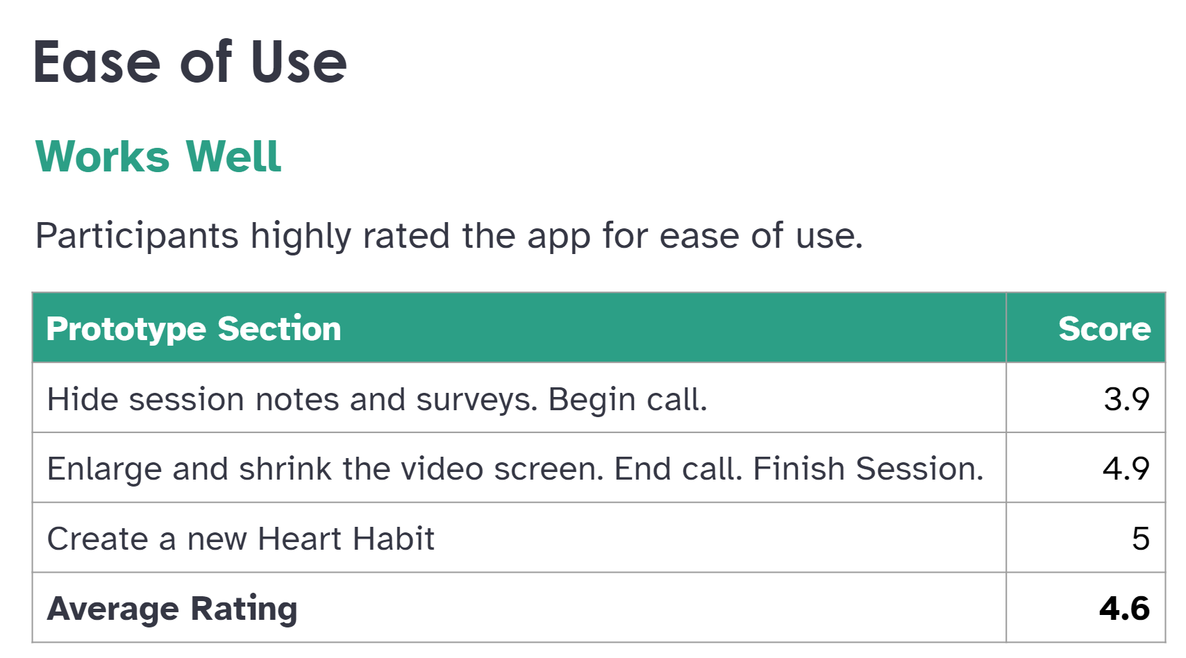
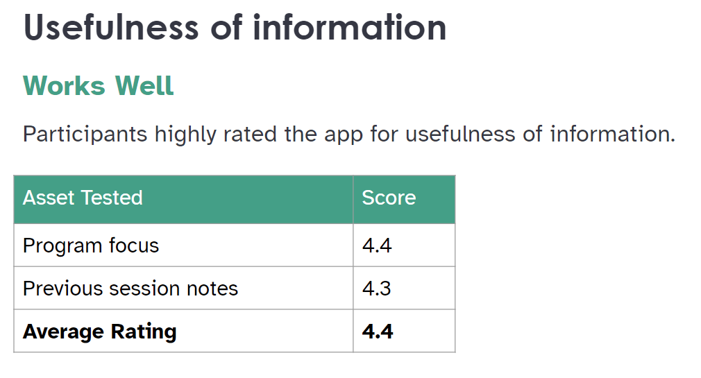
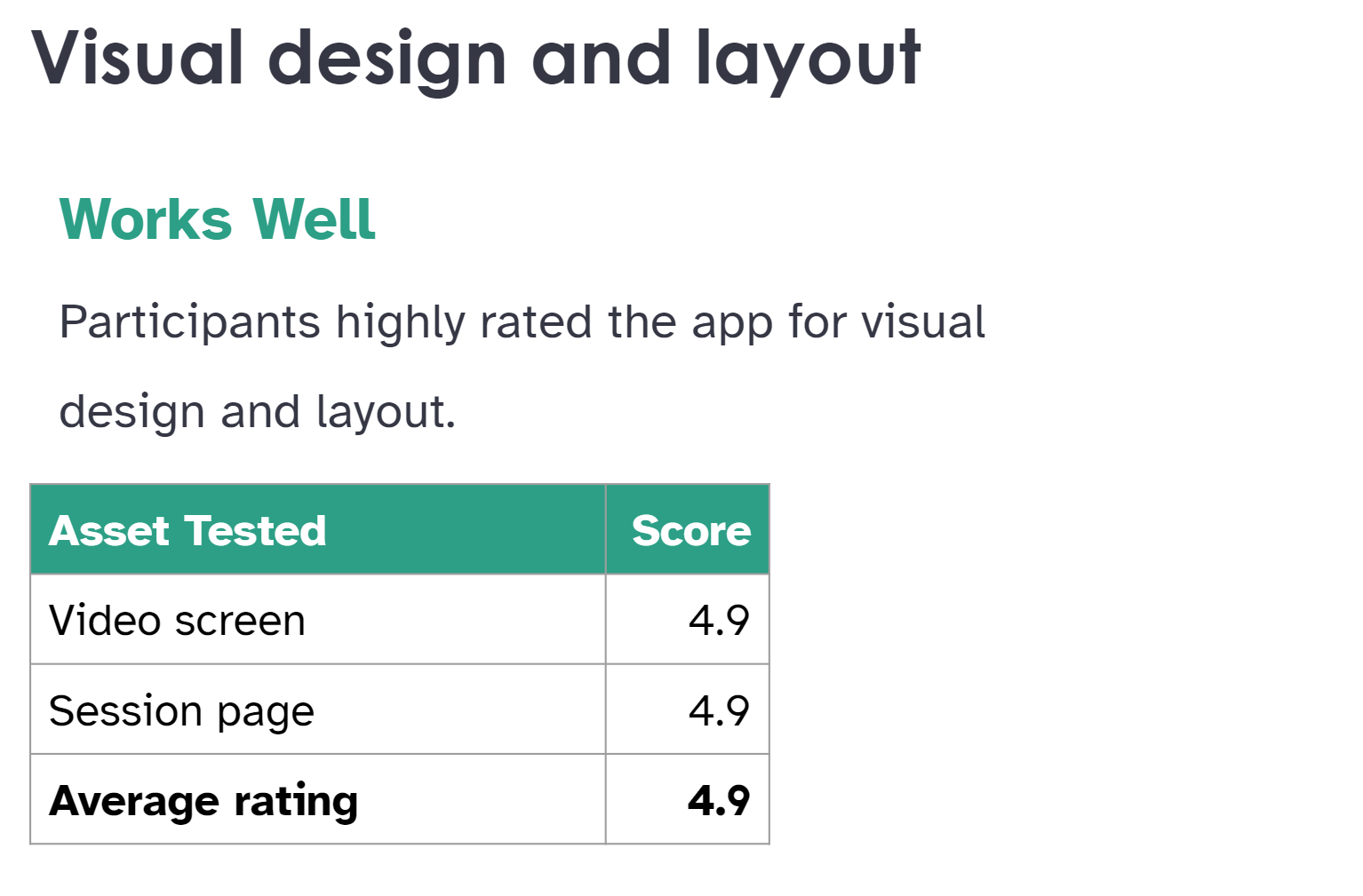
FEEDBACK & TESTING
Working with our User Researcher, we conducted multiple usability tests using screenshots and prototypes to test ease of use, usefulness of information, and overall visual design and layout of the entire platform.
Results for Dashboard
High severity issue:
• Noncompliant status is unclear and easily confused with inactive.

Results for Member List and Inbox
High severity issue:
• 6 of 7 participants assumed status chips were clickable buttons.
• The color of the blood pressure chip to indicate crisis is unclear.
Results for Session page and video expanded
WHAT'S NEXT
Based on the research results, we've updated the designs and the product has been launched. We are in process of signing up our first clients.